The Power of Color Contrast
What do mantis shrimp, digital sensors, and Schindler’s List have in common? In this episode, we explore how color works, not just in theory, but in practice, through the eyes of cameras and the minds of filmmakers. From the science behind the Bayer sensor to the emotional power of hue, saturation, and value, we unpack how the language of color shapes what we see on screen. Whether you’re a filmmaker, designer, or just curious how a red dress can feel cold and a blue room can burn, this one will change how you see your next shot.
This is a transcript from Visium: The Secret Language of Images. Listen to the episode below:
Somewhere out in the Pacific Ocean, between eastern Africa and Hawaii, lives a tiny creature with superpowered vision—the mantis shrimp. This little animal can see more colors than any other known creature on Earth.
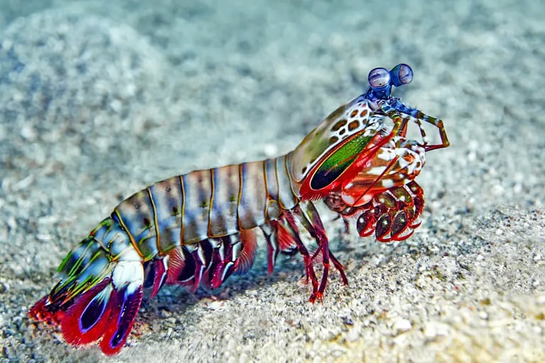
Mantis Shrimp
You might remember that humans have three types of cone cells in our eyes. These are the cells responsible for detecting color, and they roughly align with red, green, and blue. The mantis shrimp has sixteen types of cones. And not only can it see more colors than we can imagine, but its vision also reaches beyond the visible spectrum into ultraviolet light. How many colors can it actually see? No one knows for sure, but it’s probably far more than we’ll ever perceive.
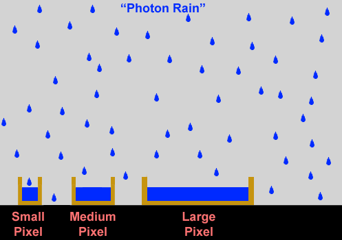
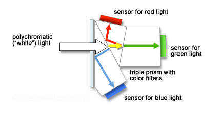
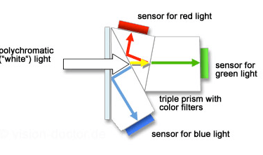
Now, in the world of humans, our knowledge of the eye and how it sees color has shaped a lot of things—especially cameras. Modern digital cinema cameras typically have a single image sensor to capture the scene. But it didn’t start that way. Early digital cameras used three separate sensors—one each for red, green, and blue. They used a prism, like the one Newton used in his famous experiment, to split incoming light apart and send it to the three different sensors. The signals were then combined to make one color image. The reason this was needed is because of the way digital sensors work. They’re actually not that smart. Imagine a digital sensor like a grid of small buckets, and light like rain falling on the buckets. The buckets collect the water and then we measure the water level in each bucket, or pixel. If there’s more light, or more drops, then it’s brighter. If there no light, or no water, then it’s black. Pretty simple right?
Rods and Cones in the retina
But color doesn’t factor in here at all. It works well to create a B&W image. So to overcome this, three sensors were used recording the brightness of red, green and blue separably. The only problem with that is that three sensors is expensive, and the prism dispersing light also reduced its intensity. And we, what do we want? Cheap cameras that can see in the dark right?
A color model is a language for describing color in a consistent way. It's how we make color (a subjective thing) something we can use in a collaborative environment, like a movie set.
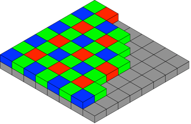
That’s where Bryce Bayer, a scientist at Kodak, comes in. He created a smart solution called the Bayer pattern sensor. Instead of using three sensors, modern cameras only use one. It's covered by a grid of tiny filters—some red, some green, and some blue. Each pixel on the sensor gets just one of those filters, so it only captures part of the color information. After the image is recorded, through some pretty advanced math, the camera fills in the gaps by estimating—or “interpolating”—what the missing colors should be.
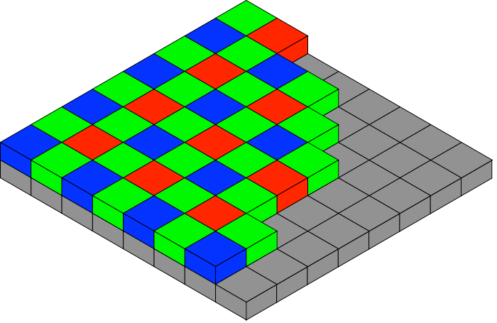
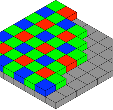
The Bayer pattern
To make this work, engineers had to figure out how to separate light into two parts: brightness (also called luminance) and color (called chrominance). Imagine this like having a black-and-white image representing brightness and a layer of color on top. Engineers discovered that if you reduce the quality in the color layer but keep the black-and-white layer sharp, our eyes won’t really notice. This is a form of loseless compression—where we lose image information, but the audience can’t tell.
This worked well for the Bayer sensor, except for one challenge. That same single sensor has to capture both brightness and color. So engineers leaned on what they knew about human vision—mainly, that our eyes are most sensitive to green, which falls in the middle of the visible spectrum. That’s why the Bayer pattern gives 50% of the sensor surface to green filters, and only 25% each to red and blue, arranged in a checkerboard pattern. Just like our eyes, the camera prioritizes green.
We’re not a tech podcast, so we won’t dig much deeper than that—but knowing this explains a lot. For example, if you’ve ever filmed a scene lit entirely in red light (like a photography darkroom) you might’ve noticed it looks soft or blurry. That’s not your lens. It’s because the camera can’t rely on the green-heavy part of the sensor. With only 25% of the sensor “seeing” red, the camera has to work extra hard to fill in the missing 75% of the picture—and the result can look less sharp, almost like it’s slightly out of focus.
So, next time you plan a scene with strong color, especially a single dominant one, just remember: your camera sees differently than you do. And it all comes back to the human eye.
So, yeah there’s so much to talk about when it comes to color. I’m Tal Lazar, and this is Visium—where we explore images and figure out what makes them work. In this first series, we’re focusing on the images you see in movies.
This is our second episode about color. In the first one, we tackled some basic but big questions—like what color actually is. We talked about how color works in additive systems, like with light, where combining colors creates new ones. And we looked at subtractive color, like in paint or when light reflects off a green leaf, where colors are created by removing parts of the light spectrum.
We also took a close look at the human visual system, breaking down things like after-images and color constancy—and how they affect what we see, and how we can use those effects creatively. That was a lot to cover. And guess what? We're not done. Color isn’t just slippery in how we see it—it’s also tricky to talk about. Since everyone sees color a little differently, how do we agree on what we’re looking at? That’s where color models come in.
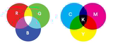
A color model is basically a language for describing color in a consistent way. It's how we make color (a subjective thing) something we can use in a collaborative environment, like a movie set. Your camera, computer, and phone use the RGB color model—three numbers to describe the intensity of red, green, and blue. Mix them in different amounts, and you can make just about any color.
But printers work with a different model: CMYK—short for cyan, magenta, yellow, and black. That’s four numbers instead of three, because it’s based on how paints work when mixed. So when you print an image, your computer has to convert RGB to CMYK. It does that using something called a LUT—a look-up table. You might’ve heard of LUTs in editing and color grading too, because they’re used in a lot of workflows. Everything starts coming together.
Now here’s where it gets really practical. Computers are happy working with RGB or CMYK, but humans don’t usually talk about color in numbers like “255, 0, 150.” It’s not how we naturally think. So instead, we use the HSV color model. That stands for hue, saturation, and value (or brightness). And it’s important to be familiar with this model—because in filmmaking, it’s the common language that everyone who works with color uses. That includes cinematographers, lighting technicians, and colorists—but also production designers, costume designers, hair stylists, and makeup artists. It’s a shared vocabulary that helps the entire visual team stay on the same page. And as we get deeper into color, we’ll keep referring back to this model. So keep that in mind as we continue. Understanding HSV—and how it breaks color into parts you can control—is the key to using color with intention.
So what’s HSV?
Hue is simply the name of the color—like red, purple, green, or brown.
Saturation tells us how vivid or intense that color is. A very saturated color is bold and vibrant, and a desaturated one leans toward neutral.
Value is the brightness—how light or dark the color appears.
If you’ve ever used a program like Adobe Photoshop or any graphic design tool, you’ve probably seen color pickers that let you adjust hue, saturation, and value independently. But here’s the catch: even though they’re listed separately, changing one usually affects the others.
Adobe Photoshop Color Picker

Take red, for example. It tends to look most vivid when it’s dark. If you brighten red a lot, its hue starts to shift and look more like pink. Yellow is just the opposite. It looks most saturated when it’s bright. Try to imagine a dark, vivid yellow—it’s pretty much impossible.
Some colors (like red and green) can appear to have very different brightness levels, but in terms of actual value, they might be the same. If you desaturate both completely, you could end up with the exact same shade of gray. That’s why it’s so important to understand how hue, saturation, and value each function on their own. If we want to use color well, or talk about it clearly, we’ve got to be able to separate and recognize these characteristics.
When I taught at AFI, we used camera tests as a way to practice seeing and understanding color. One of the exercises we did was called an over/under test. It’s pretty simple—shoot a series of short clips, intentionally adjusting the exposure each time to make the image either brighter or darker than the last. What you get is a range of images that reveal a lot about the exposure limits of the camera and how it handles color.
Here’s something fun you can try: look up an exposure test online and practice describing how the color changes from shot to shot using the HSV model—hue, saturation, and value. You’ll notice that as exposure changes, the color changes too. Sometimes it’s subtle, other times it’s dramatic. You’d think that the color only changes in value when changing exposure, since we’re basically changing brightness. But hue and saturation shift too.
This brings up a key difference between video and film—how each renders color. Video is an additive process, based on RGB, which means adding more brightness can sometimes push colors into unrealistic territory. Think of movies shot on early digital cameras, where a tree in bright sunlight looked almost neon or radioactive. That’s the result of bright RGB values creating overly saturated colors.
Film behaves differently. It’s more like watercolor on white paper. Light passes through multiple layers in the film: first a layer that captures blue, then a filter that removes blue, allowing the light to travel to layers for green and then red. It’s a subtractive process. So instead of colors getting more vivid as they get brighter, they actually lose some intensity. A really bright green, for example, might look toned down, more desaturated.
Now, don’t worry if all of this sounds a little technical. It’s the cinematographer’s and colorist’s job to understand these nuances. As a director, your focus is simpler—but just as important: know what you want, and be able to say whether what you're seeing on screen matches your intention. That’s it. You don’t have to explain how a shot got to where it is—but you should be able to say, “Yes, that feels right,” or “No, we’re not there yet.” That said, the best directors I’ve worked with were also curious. They asked questions, and we had great conversations about the craft. And I always enjoyed sharing what I know with them.
By the way, one of the best ways to really understand the effect of color is through comparison. Take a colorful image and open it in any image editing program. Then, make a black and white version—just desaturate it. Now, put the two versions side by side. Don’t just look at what’s in the image—pay attention to how you react to each one. You’ll probably find that your eye is drawn to different areas in each version. Certain things will pop out in color, and others might stand out more in black and white. You’ll notice different details, and even feel slightly different just looking at them.

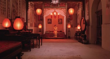
Contrast of Hue in Raise the Red Lantern
And this gets us to the next part: color in a composition. At this point, you’ve probably realized that using color isn't just about choosing to paint something red or blue. Composition is about relationships between the things on screen. And when it comes to color, we’re looking at how different colors interact with each other.
This brings us to contrast and similarity—applied to color. There are several types of color contrast, and now that we’ve got the vocabulary, we can finally break those down and look at how they work.
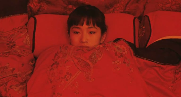
Let’s start with contrast of hue. Remember in Raise the Red Lantern when the scene cuts from a cool, blue exterior to a warm, red interior? That’s a good example of contrast of hue—placing two different colors near each other to create visual intensity. This kind of contrast works best with primary and secondary colors, like blue and yellow, not so much with colors that are close in tone, like pink and red. By the way, a secondary color is made by mixing two primaries—so green comes from blue and yellow, for example.

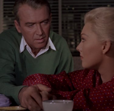
Then there’s contrast of saturation. We saw this also in Raise the Red Lantern, when the red in the scene suddenly becomes more saturated. Another classic example is from Schindler’s List. Most of the film is in black and white, but in one scene there’s a little girl wearing a pale red coat. The color is barely there—but it’s enough to stand out and capture our attention, even in a wide shot. That’s the power of contrast of saturation.

Interaction of color with its environment
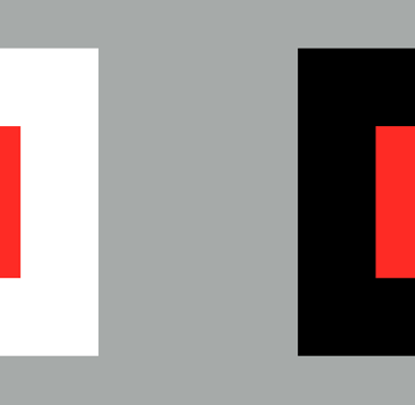
Next is contrast of value, which is what we usually think of as contrast—bright versus dark. But when color comes into play, brightness can also change how we perceive a color. Try this with any graphic design program: take a yellow square and place it on an all-white background. Then put the same square on a black background. The yellow looks different in each case—even though it hasn’t really changed. That tells us that color doesn’t exist in isolation. Its environment matters.
So if you want a red to really pop, it’s not just about making the red darker or more saturated—it’s also about choosing what to put around it. This is where collaboration becomes essential. You need to loop in the production designer, the costume designer, wardrobe, lighting—every department that touches the image. Directors like Pedro Almodóvar are famous for this kind of precise color work. To create his visual style, Almodóvar works closely with his team to make sure every piece supports the look and feel of the story. That level of coordination takes both vision and strong communication.
A frame from an over / under camera test
3 sensor camera
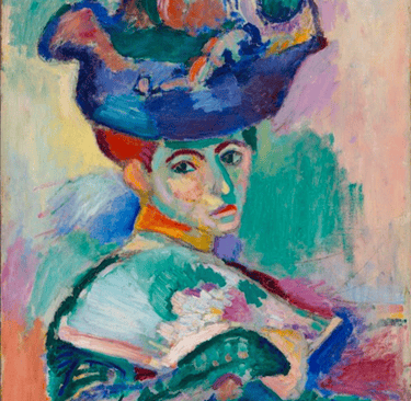
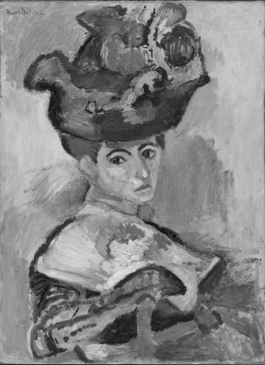
A Woman with a hat, Henri Matisse (1905)
Contrast of Saturation in Raise the Red Lantern

The Skin I Live In, directed by Pedro Almoddovar
Contrast of temperature is another important way to use color in composition. We naturally associate certain colors with temperatures—blue feels cool, red feels warm. But that’s not how actual temperature and color work. You’ve probably heard the term color temperature, like when your camera shows a white balance number, maybe 3200 or 5600. That’s based on the Kelvin scale, which comes from the physics of heating objects. If you heat a piece of metal, it’ll first glow red, then orange, then yellow, then white—and eventually blue. So the higher the temperature, the bluer the light. Technically, blue is hotter than red. But creatively, we still tend to treat blue as “cool” and red as “warm.” Go figure.
In visual storytelling, we often use contrast of temperature to show depth. You might remember from episode 11 that we associate blue tones with things that are farther away. So if you place warmer colors in the foreground and cooler tones in the background, it can help the image feel deeper—even on a flat screen.

An Education, directed by Lone Scherfig
Then there’s complementary contrast, which brings us back to complementary colors. We talked about these a bit last episode. In the RYB model, red and green are complementary. These are pairs of colors that, when placed next to each other, create the most visual intensity or punch. You’ll see this technique used in a lot of paintings and films. Placing complementary colors (like blue and yellow or red and green) side by side draws the viewer’s eye and adds drama. Van Gogh used complementary contrast a lot, as well as Hitchock in Vertigo.
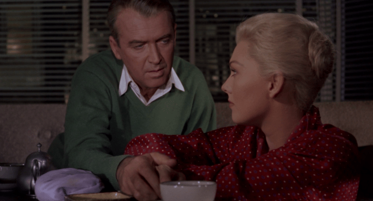
Vertigo, directed by Alfred Hitchcock
And of course, we can’t talk about contrast without touching on its opposite—similarity. Colors don’t always have to fight each other for attention. Sometimes, they blend. And that blending can be just as powerful.
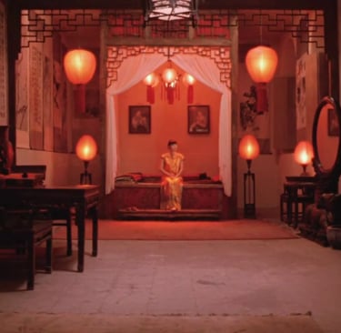
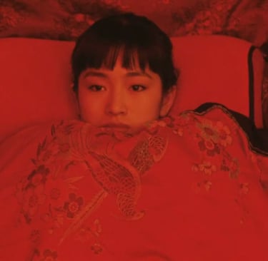
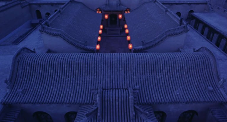
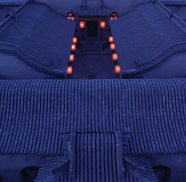
Take Bernardo Bertolucci’s The Last Emperor, for example. On the young emperor's wedding day, there’s a scene where he’s sitting beside his bride, and everything in the room is blanketed in red. Now, red is traditionally a celebratory color, especially in Chinese culture. But in this scene, the red is so overwhelming, so uniform and saturated, that instead of feeling happy, the moment comes across as empty, even lifeless.
It’s a great example of how color works on two levels. On one hand, red carries a symbolic meaning—it’s social and cultural. But at the same time, it works as part of the visual composition. When everything is the same color, we lose the contrast our eye expects. It feels still, heavy, even claustrophobic. That’s the emotional effect created by similarity.

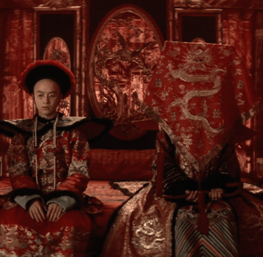
The Last Emperor, directed by Bernardo Bertolucci
And believe it or not, there’s still more to say about color—but we’re going to pause here and move on to our final design element: movement. We’ll talk about that in the next episode. In the meantime, if you want to dig deeper into color, I highly recommend two classic books: Interaction of Color by Josef Albers and The Elements of Color by Johannes Itten. Both are excellent resources for understanding how color works—not just technically, but emotionally, in the context of visual storytelling.
If you're enjoying this journey, make sure to subscribe, leave a review, and join me next time as we keep exploring how filmmakers bring images—and stories—to life.
If you have any thought, an example that wasn’t mentioned or a question, feel free to reach out—just email tal@cinematicimpact.com. You can also check out my book at TheLanguageofCinematography.com.
Thanks for spending time with me today. Goodbye!
This is a transcript from Visium: The Secret Language of Images. Listen to the episode below:
Somewhere out in the Pacific Ocean, between eastern Africa and Hawaii, lives a tiny creature with superpowered vision—the mantis shrimp. This little animal can see more colors than any other known creature on Earth.

Mantis Shrimp
You might remember that humans have three types of cone cells in our eyes. These are the cells responsible for detecting color, and they roughly align with red, green, and blue. The mantis shrimp has sixteen types of cones. And not only can it see more colors than we can imagine, but its vision also reaches beyond the visible spectrum into ultraviolet light. How many colors can it actually see? No one knows for sure, but it’s probably far more than we’ll ever perceive.
Now, in the world of humans, our knowledge of the eye and how it sees color has shaped a lot of things—especially cameras. Modern digital cinema cameras typically have a single image sensor to capture the scene. But it didn’t start that way. Early digital cameras used three separate sensors—one each for red, green, and blue. They used a prism, like the one Newton used in his famous experiment, to split incoming light apart and send it to the three different sensors. The signals were then combined to make one color image. The reason this was needed is because of the way digital sensors work. They’re actually not that smart. Imagine a digital sensor like a grid of small buckets, and light like rain falling on the buckets. The buckets collect the water and then we measure the water level in each bucket, or pixel. If there’s more light, or more drops, then it’s brighter. If there no light, or no water, then it’s black. Pretty simple right?
Rods and Cones in the retina
But color doesn’t factor in here at all. It works well to create a B&W image. So to overcome this, three sensors were used recording the brightness of red, green and blue separably. The only problem with that is that three sensors is expensive, and the prism dispersing light also reduced its intensity. And we, what do we want? Cheap cameras that can see in the dark right?
A color model is a language for describing color in a consistent way. It's how we make color (a subjective thing) something we can use in a collaborative environment, like a movie set.
That’s where Bryce Bayer, a scientist at Kodak, comes in. He created a smart solution called the Bayer pattern sensor. Instead of using three sensors, modern cameras only use one. It's covered by a grid of tiny filters—some red, some green, and some blue. Each pixel on the sensor gets just one of those filters, so it only captures part of the color information. After the image is recorded, through some pretty advanced math, the camera fills in the gaps by estimating—or “interpolating”—what the missing colors should be.
The Bayer pattern
To make this work, engineers had to figure out how to separate light into two parts: brightness (also called luminance) and color (called chrominance). Imagine this like having a black-and-white image representing brightness and a layer of color on top. Engineers discovered that if you reduce the quality in the color layer but keep the black-and-white layer sharp, our eyes won’t really notice. This is a form of loseless compression—where we lose image information, but the audience can’t tell.
This worked well for the Bayer sensor, except for one challenge. That same single sensor has to capture both brightness and color. So engineers leaned on what they knew about human vision—mainly, that our eyes are most sensitive to green, which falls in the middle of the visible spectrum. That’s why the Bayer pattern gives 50% of the sensor surface to green filters, and only 25% each to red and blue, arranged in a checkerboard pattern. Just like our eyes, the camera prioritizes green.
We’re not a tech podcast, so we won’t dig much deeper than that—but knowing this explains a lot. For example, if you’ve ever filmed a scene lit entirely in red light (like a photography darkroom) you might’ve noticed it looks soft or blurry. That’s not your lens. It’s because the camera can’t rely on the green-heavy part of the sensor. With only 25% of the sensor “seeing” red, the camera has to work extra hard to fill in the missing 75% of the picture—and the result can look less sharp, almost like it’s slightly out of focus.
So, next time you plan a scene with strong color, especially a single dominant one, just remember: your camera sees differently than you do. And it all comes back to the human eye.
So, yeah there’s so much to talk about when it comes to color. I’m Tal Lazar, and this is Visium—where we explore images and figure out what makes them work. In this first series, we’re focusing on the images you see in movies.
This is our second episode about color. In the first one, we tackled some basic but big questions—like what color actually is. We talked about how color works in additive systems, like with light, where combining colors creates new ones. And we looked at subtractive color, like in paint or when light reflects off a green leaf, where colors are created by removing parts of the light spectrum.
We also took a close look at the human visual system, breaking down things like after-images and color constancy—and how they affect what we see, and how we can use those effects creatively. That was a lot to cover. And guess what? We're not done. Color isn’t just slippery in how we see it—it’s also tricky to talk about. Since everyone sees color a little differently, how do we agree on what we’re looking at? That’s where color models come in.
A color model is basically a language for describing color in a consistent way. It's how we make color (a subjective thing) something we can use in a collaborative environment, like a movie set. Your camera, computer, and phone use the RGB color model—three numbers to describe the intensity of red, green, and blue. Mix them in different amounts, and you can make just about any color.
But printers work with a different model: CMYK—short for cyan, magenta, yellow, and black. That’s four numbers instead of three, because it’s based on how paints work when mixed. So when you print an image, your computer has to convert RGB to CMYK. It does that using something called a LUT—a look-up table. You might’ve heard of LUTs in editing and color grading too, because they’re used in a lot of workflows. Everything starts coming together.
Now here’s where it gets really practical. Computers are happy working with RGB or CMYK, but humans don’t usually talk about color in numbers like “255, 0, 150.” It’s not how we naturally think. So instead, we use the HSV color model. That stands for hue, saturation, and value (or brightness). And it’s important to be familiar with this model—because in filmmaking, it’s the common language that everyone who works with color uses. That includes cinematographers, lighting technicians, and colorists—but also production designers, costume designers, hair stylists, and makeup artists. It’s a shared vocabulary that helps the entire visual team stay on the same page. And as we get deeper into color, we’ll keep referring back to this model. So keep that in mind as we continue. Understanding HSV—and how it breaks color into parts you can control—is the key to using color with intention.
So what’s HSV?
Hue is simply the name of the color—like red, purple, green, or brown.
Saturation tells us how vivid or intense that color is. A very saturated color is bold and vibrant, and a desaturated one leans toward neutral.
Value is the brightness—how light or dark the color appears.
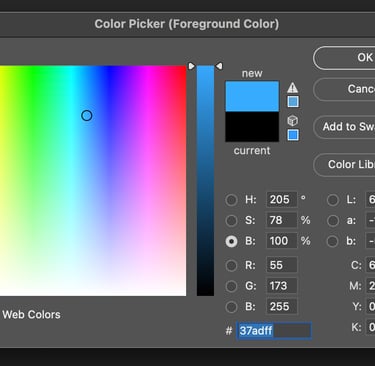
If you’ve ever used a program like Adobe Photoshop or any graphic design tool, you’ve probably seen color pickers that let you adjust hue, saturation, and value independently. But here’s the catch: even though they’re listed separately, changing one usually affects the others.
Adobe Photoshop Color Picker
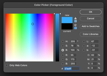
Take red, for example. It tends to look most vivid when it’s dark. If you brighten red a lot, its hue starts to shift and look more like pink. Yellow is just the opposite. It looks most saturated when it’s bright. Try to imagine a dark, vivid yellow—it’s pretty much impossible.
Some colors (like red and green) can appear to have very different brightness levels, but in terms of actual value, they might be the same. If you desaturate both completely, you could end up with the exact same shade of gray. That’s why it’s so important to understand how hue, saturation, and value each function on their own. If we want to use color well, or talk about it clearly, we’ve got to be able to separate and recognize these characteristics.
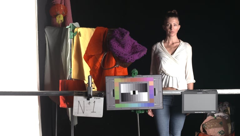
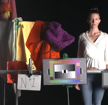
When I taught at AFI, we used camera tests as a way to practice seeing and understanding color. One of the exercises we did was called an over/under test. It’s pretty simple—shoot a series of short clips, intentionally adjusting the exposure each time to make the image either brighter or darker than the last. What you get is a range of images that reveal a lot about the exposure limits of the camera and how it handles color.
Here’s something fun you can try: look up an exposure test online and practice describing how the color changes from shot to shot using the HSV model—hue, saturation, and value. You’ll notice that as exposure changes, the color changes too. Sometimes it’s subtle, other times it’s dramatic. You’d think that the color only changes in value when changing exposure, since we’re basically changing brightness. But hue and saturation shift too.
This brings up a key difference between video and film—how each renders color. Video is an additive process, based on RGB, which means adding more brightness can sometimes push colors into unrealistic territory. Think of movies shot on early digital cameras, where a tree in bright sunlight looked almost neon or radioactive. That’s the result of bright RGB values creating overly saturated colors.
Film behaves differently. It’s more like watercolor on white paper. Light passes through multiple layers in the film: first a layer that captures blue, then a filter that removes blue, allowing the light to travel to layers for green and then red. It’s a subtractive process. So instead of colors getting more vivid as they get brighter, they actually lose some intensity. A really bright green, for example, might look toned down, more desaturated.
Now, don’t worry if all of this sounds a little technical. It’s the cinematographer’s and colorist’s job to understand these nuances. As a director, your focus is simpler—but just as important: know what you want, and be able to say whether what you're seeing on screen matches your intention. That’s it. You don’t have to explain how a shot got to where it is—but you should be able to say, “Yes, that feels right,” or “No, we’re not there yet.” That said, the best directors I’ve worked with were also curious. They asked questions, and we had great conversations about the craft. And I always enjoyed sharing what I know with them.
By the way, one of the best ways to really understand the effect of color is through comparison. Take a colorful image and open it in any image editing program. Then, make a black and white version—just desaturate it. Now, put the two versions side by side. Don’t just look at what’s in the image—pay attention to how you react to each one. You’ll probably find that your eye is drawn to different areas in each version. Certain things will pop out in color, and others might stand out more in black and white. You’ll notice different details, and even feel slightly different just looking at them.
Contrast of Hue in Raise the Red Lantern
And this gets us to the next part: color in a composition. At this point, you’ve probably realized that using color isn't just about choosing to paint something red or blue. Composition is about relationships between the things on screen. And when it comes to color, we’re looking at how different colors interact with each other.
This brings us to contrast and similarity—applied to color. There are several types of color contrast, and now that we’ve got the vocabulary, we can finally break those down and look at how they work.
Let’s start with contrast of hue. Remember in Raise the Red Lantern when the scene cuts from a cool, blue exterior to a warm, red interior? That’s a good example of contrast of hue—placing two different colors near each other to create visual intensity. This kind of contrast works best with primary and secondary colors, like blue and yellow, not so much with colors that are close in tone, like pink and red. By the way, a secondary color is made by mixing two primaries—so green comes from blue and yellow, for example.
Then there’s contrast of saturation. We saw this also in Raise the Red Lantern, when the red in the scene suddenly becomes more saturated. Another classic example is from Schindler’s List. Most of the film is in black and white, but in one scene there’s a little girl wearing a pale red coat. The color is barely there—but it’s enough to stand out and capture our attention, even in a wide shot. That’s the power of contrast of saturation.
Interaction of color with its environment
Next is contrast of value, which is what we usually think of as contrast—bright versus dark. But when color comes into play, brightness can also change how we perceive a color. Try this with any graphic design program: take a yellow square and place it on an all-white background. Then put the same square on a black background. The yellow looks different in each case—even though it hasn’t really changed. That tells us that color doesn’t exist in isolation. Its environment matters.
So if you want a red to really pop, it’s not just about making the red darker or more saturated—it’s also about choosing what to put around it. This is where collaboration becomes essential. You need to loop in the production designer, the costume designer, wardrobe, lighting—every department that touches the image. Directors like Pedro Almodóvar are famous for this kind of precise color work. To create his visual style, Almodóvar works closely with his team to make sure every piece supports the look and feel of the story. That level of coordination takes both vision and strong communication.
A frame from an over / under camera test


3 sensor camera

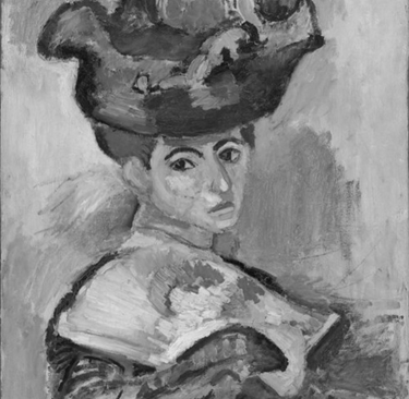
A Woman with a hat, Henri Matisse (1905)

Contrast of Saturation in Raise the Red Lantern

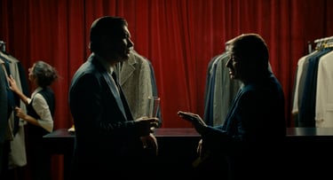
The Skin I Live In, directed by Pedro Almoddovar
Contrast of temperature is another important way to use color in composition. We naturally associate certain colors with temperatures—blue feels cool, red feels warm. But that’s not how actual temperature and color work. You’ve probably heard the term color temperature, like when your camera shows a white balance number, maybe 3200 or 5600. That’s based on the Kelvin scale, which comes from the physics of heating objects. If you heat a piece of metal, it’ll first glow red, then orange, then yellow, then white—and eventually blue. So the higher the temperature, the bluer the light. Technically, blue is hotter than red. But creatively, we still tend to treat blue as “cool” and red as “warm.” Go figure.
In visual storytelling, we often use contrast of temperature to show depth. You might remember from episode 11 that we associate blue tones with things that are farther away. So if you place warmer colors in the foreground and cooler tones in the background, it can help the image feel deeper—even on a flat screen.
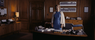
An Education, directed by Lone Scherfig
Then there’s complementary contrast, which brings us back to complementary colors. We talked about these a bit last episode. In the RYB model, red and green are complementary. These are pairs of colors that, when placed next to each other, create the most visual intensity or punch. You’ll see this technique used in a lot of paintings and films. Placing complementary colors (like blue and yellow or red and green) side by side draws the viewer’s eye and adds drama. Van Gogh used complementary contrast a lot, as well as Hitchock in Vertigo.
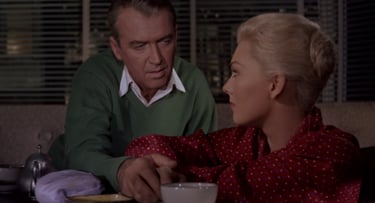
Vertigo, directed by Alfred Hitchcock
And of course, we can’t talk about contrast without touching on its opposite—similarity. Colors don’t always have to fight each other for attention. Sometimes, they blend. And that blending can be just as powerful.
Take Bernardo Bertolucci’s The Last Emperor, for example. On the young emperor's wedding day, there’s a scene where he’s sitting beside his bride, and everything in the room is blanketed in red. Now, red is traditionally a celebratory color, especially in Chinese culture. But in this scene, the red is so overwhelming, so uniform and saturated, that instead of feeling happy, the moment comes across as empty, even lifeless.
It’s a great example of how color works on two levels. On one hand, red carries a symbolic meaning—it’s social and cultural. But at the same time, it works as part of the visual composition. When everything is the same color, we lose the contrast our eye expects. It feels still, heavy, even claustrophobic. That’s the emotional effect created by similarity.
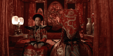
The Last Emperor, directed by Bernardo Bertolucci
And believe it or not, there’s still more to say about color—but we’re going to pause here and move on to our final design element: movement. We’ll talk about that in the next episode. In the meantime, if you want to dig deeper into color, I highly recommend two classic books: Interaction of Color by Josef Albers and The Elements of Color by Johannes Itten. Both are excellent resources for understanding how color works—not just technically, but emotionally, in the context of visual storytelling.
If you're enjoying this journey, make sure to subscribe, leave a review, and join me next time as we keep exploring how filmmakers bring images—and stories—to life.
If you have any thought, an example that wasn’t mentioned or a question, feel free to reach out—just email tal@cinematicimpact.com. You can also check out my book at TheLanguageofCinematography.com.
Thanks for spending time with me today. Goodbye!