Images that Move
What if the power of an image isn’t about dollies or cranes, but time: how long you’re held, and how movement against stillness steers what you feel and notice? From Interiors’ stillness to The Hunger Games’ erraticness, movement can guide our eye beat by beat. Study of eye-tracking further reveals how guiding eye movement lead our minds exactly to where the director wants.
This is a transcript from Visium: The Secret Language of Images. Listen to the episode below:
Do you like going to museums? I certainly do. We walk through the galleries, stop in front of paintings, look at brushstrokes, and try to absorb the work. But here’s a question—how long do you think people actually spend looking at art in a museum?
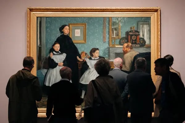
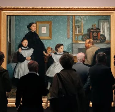
People at The Met
According to several studies done over the last 20 years, the average time someone spends observing a single work of art is… about 25 seconds. Yep, that’s it.
When you think about how long painters spend creating those works, sometimes months, even years, that number feels a little short. And we thought filmmakers had it rough!
Now shift that idea over to film. When most people hear "movement" in filmmaking, they usually think of the gear—dollies, Steadicams, cranes. We’re trained to think about the tools. But this series isn’t about gear—it’s about the why behind using it. And with movement, it comes down to something more basic: time.
Because camera movement isn’t just about going from point A to point B. How fast or slow that movement happens controls the viewer’s experience—what they feel, when they feel it, and how long they’re invited to stay in a moment.
Sound interesting? Good—because that’s exactly what we’ll dive into next. I’m Tal Lazar, and this is Visium—where we explore images and figure out what makes them work. In this first series, we’re focusing on the images you see in movies.
The biggest difference between looking at a photograph and watching a scene in a movie comes down to control. When you’re standing in front of a photo at a museum for 25 seconds, you can walk away anytime. You chose to stop and look. Movies work differently. You agree, at least for a little while, to give up that control. Sure, you can leave, but it usually takes something really off-putting to make you walk out. Or maybe just too much soda. Either way, the director expects that you're watching, and they use that time to control the experience.
That’s not how it works with social media. There, creators know they’re in a constant battle for your attention. Be boring for a split second, and your audience is already onto the next thing. A movie director, on the other hand, can count on you sticking around, for a bit, at least, and that gives them room to tell a story over time.
So what do filmmakers actually do with that time they have? Let’s start with movies that treat images more like photographs—no camera movement at all. Of course, there are still differences, like soundtracks and editing, but each shot stays still, almost like a photo.
To fully understand movement, we need to do the same thing we did with everything else. Look at our own reaction. What do you think about? Where are you looking?
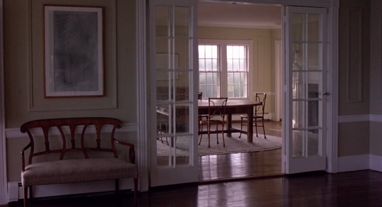
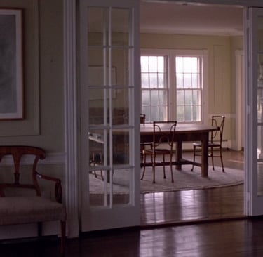
Take Woody Allen’s Interiors for example. It opens with a static shot of an empty living room in a beach house. No music, no dialogue. Just silence. You’re looking at that shot for about eight seconds. And yeah, that’s longer than it sounds. This is 8 seconds (close your eyes and count to 8).

The Hunger Games, directed by Gary Ross
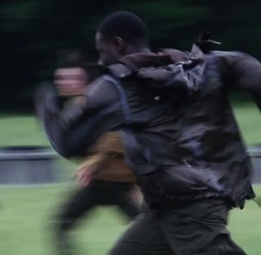
In some scenes in The Hunger Games, you never get a break. The shots come fast—so fast that before you can take in anything beyond the main subject, the image is gone. It’s like someone throwing information at you before you’ve had a chance to process the last thing they said. And that pace keeps going for minutes at a time. In some scenes, the average shot lasts less than a second.
It’s overwhelming. You feel off-balance, like your brain can’t quite keep up. But that’s what the main character is feeling too. She’s been thrown into a chaotic, violent game, and everything is happening at once, just like it is for us. That sense of confusion? That’s the point. It’s not just style, it’s storytelling.
In The Hunger Games, you don’t get time to explore. Watching it is more like that scene in Kubrick’s A Clockwork Orange—the one where a guy’s eyes are forced open so he can’t look away. After a while, it’s exhausting.
Now compare that to Interiors. There, the audience has time. We’re invited to slow down, explore the image, and search for meaning. But that comes with its own challenge. If there’s nothing to find, or if we’re left alone with an image for too long, we get tired in a different way.
So now we’re ready to talk about movement. Actually, we’re also ready to talk about editing. Because when we ask, “When should the camera move? When do we cut?” we’re really asking something deeper: How long should we let the viewer stay with an image? What are they doing with that time?
To explore that, we need to understand what’s happening in the viewer’s mind while they’re watching. And from looking at these two very different films, we’re starting to get a clearer idea.
Alfred Yarbus was a Soviet psychologist who studied eye movements back in the 1950s and '60s. He’s well known for his experiments on how and where people look when they examine an image. Now, this was long before we had the kind of fancy eye-tracking tech we use today. Let’s just say it involved suction cups and leave it at that. His findings turned out to be incredibly useful for filmmakers.
Take a second and think about it—what makes someone look at one part of an image over another? Most filmmakers would probably say the eye goes to the brightest spot, or that people focus on faces first. I was taught that too. I spent years assuming design elements like brightness, contrast, or leading lines controlled where the audience looked. And those things do matter—but they’re actually not the biggest factor.
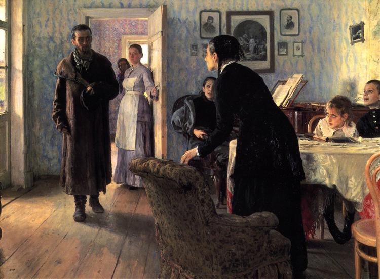
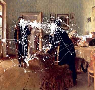
Yarbus showed people a painting called The Visitor and tracked their eye movements. If you look it up, you’ll find Yarbus’ versions of the image, showing the lines drawn across that image where people’s eyes traveled. What he found was surprising: when people looked at the painting without any instructions, yes, they tended to look at the people in the image first. But it wasn’t just because they were faces or humans. It was because viewers were trying to figure out the story—what’s going on in this scene?
Yarbus took it a step further. He gave viewers little prompts or questions before they looked at the painting for the first time. If he asked them to think about class or wealth, they started looking closely at the characters' clothes and examine the space. If he mentioned a long journey, people focused on the visitor’s bag. So it wasn’t the image alone that guided the eye, but what the viewer was thinking about. The questions in their head shaped how they looked.
The Retina
In movies, this happens all the time. The story itself raises those questions. We don’t always tell viewers where to look directly, but we guide them by setting up what to care about, and those questions lead the eye.
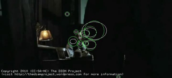
There’s a fascinating research project out of the UC Davis Visual Cognition Lab called the DIEM project—short for Dynamic Images and Eye Movements. They’ve done a lot of work tracking where people look while watching video, and one of the standout examples comes from a scene in Paul Thomas Anderson’s There Will Be Blood.
In the scene, a young man walks into a room and meets two others. In the DIEM project’s version of the scene you can actually see viewers’ eyes, represented by dots on the screen, scanning the space. It’s like they’re asking: Where are we? Who is this person? What’s about to happen? Then, once the characters start talking, something really interesting happens. Before one man even finishes a question, the audience’s eyes jump over to the other person, anticipating a response. You can actually track the thought process of the viewer through their gaze. It’s like watching a conversation unfold not just between the characters, but between the film and its audience.
So what does this have to do with camera movement?
Now that we understand what the audience is doing while watching, how they take in information, we can start making more thoughtful decisions about where, when, and why to move the camera. We can also better decide when to cut, or when to let something new enter the frame without cutting.
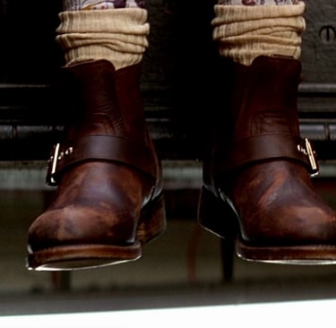
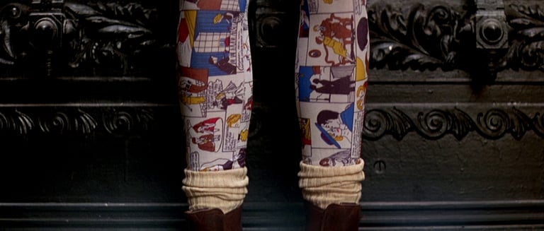
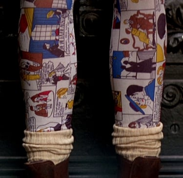
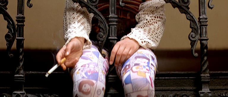
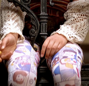
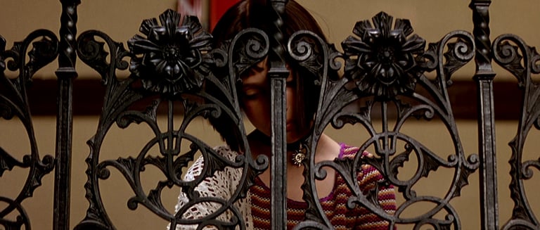
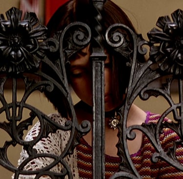
One great example of this kind of intentional camera movement is the opening of Léon: The Professional. The entire sequence controls how we take in information, step by step. The shot begins with a pair of dangling feet in heavy leather boots. The camera slowly moves up—and now we see colored tights. That’s surprising. Oh, it’s a child. Then the camera moves higher and we see a hand holding a cigarette. That raises new questions. How old is this child? What’s going on here? Finally, the camera reaches her face, leaning against metal bars. She’s young—but now we understand more. In just one shot, we learn that she feels trapped, that she’s had to grow up too soon. The layering of images builds meaning. The impact is greater than the sum of the parts. And all of that comes from knowing how the audience watches, and using the camera to guide them through the story, one piece at a time.

Léon: The Professional, directed by Luc Besson
So how would that scene in Léon: The Professional feel different if, instead of using a moving camera, it was made up of separate cuts? Well, every time a cut happens, something important takes place in the viewer’s mind. The first thing we do is reorient ourselves. Even though it only takes a fraction of a second, we still have to figure out where we are now. After that, we apply what we already know to this new shot. It’s no longer just a generic question like “What’s happening?” Instead, it becomes more specific—“How does this new piece fit into what I’ve already seen?”
Also, whether we realize it or not, we treat the cut itself as a kind of cue. A hint. The filmmaker is quietly saying, “Look here. This matters.” And because we’ve learned to think that way, we assume something’s changed with each cut. That something’s worth noticing. If, as a filmmaker, you cut too much—especially without a good reason—the audience starts to feel it. It starts to feel mechanical, maybe even annoying. That’s why every cut really needs to move the story forward. Unless, of course, you’re intentionally trying to slow things down.
Now, with camera movement, something different happens. There’s no sudden reorientation. We stay grounded, right there in the space. We’re just slowly discovering more. Yes, camera movement can still draw attention to itself—sometimes even more than a cut—but it works differently depending on how it’s used.
That’s where the idea of motivated versus unmotivated camera movement comes in. Motivated movement follows something happening on screen—a character turning their head, someone walking into the frame, a car driving by. Instead of leading us, the camera follows our existing curiosity. It aligns naturally with where our eyes and minds want to go. When that happens, movement feels almost invisible. It feels natural, like we wanted to go there anyway. And that’s the trick. It feels like it just happened, but of course, everything is carefully planned.
Unmotivated camera movement is when the camera moves without following any visual on-screen cue. There’s no character to follow, no action on screen prompting it—it just moves. And for the audience, that can be distracting if there’s no narrative context to support it.
When I explain this to students, I show them a shot I filmed from a rooftop, looking over a city. It’s a calm view, and then suddenly, the camera shakes. Most students say it pulls them out of the moment. They think something went wrong with the equipment. But then I play the same shot again, only this time, just before the shake, there’s a loud explosion. Suddenly, no one’s confused. The camera still isn’t following anything we can see (it’s technically still unmotivated) but the movement makes sense now because there’s story behind it. That’s the key. Even unmotivated movement can feel natural if the context is right.
Raise the Red Lantern, directed by Zhang Yimou
It's a little confusing, I know. But this is how the term is used in filmmaking. And if you want to communicate clearly with camera crews, especially on set, it helps to understand that "unmotivated" just means the camera isn’t reacting to something visible in the frame—it’s not a judgment call about whether the movement works or not.
Another thing that can really shape how a camera move feels is when it starts in the shot. If the camera stays still at first, and then starts moving, there’s a shift—a contrast between stillness and motion. That change can build tension, create emphasis, or add drama. But it can also pull attention in a way that’s jarring if it's not handled carefully. If the camera moves right after a cut, then the effect is different.
So you can see, there are a lot of levers you can pull with camera movement—and we haven’t even gotten into how the camera moves. Whether you're using a dolly, a drone, or a gimbal… that part comes later. What matters first is why you’re moving the camera, when you start moving it, how fast it moves, and what the viewer knows when it happens. That's the real storytelling work.
To fully understand movement, we need to do the same thing we did with everything else. Look at our own reaction. What do you think about? Where are you looking? Are you feeling anything? After finding that out, we can check and see how camera movement assisted, or prevented, anything.
At the core, movement has several functions:
Revealing information at a certain pace. We saw that in all of the examples I gave up to this point. Even in The Hunger Games, where the audience is prevented from exploring the world too much
Create an experience with the movement itself. In Interiors we felt trapped. That’s exactly what the character who starts narrating the opening scene, talks about. In The Hunger Games we felt disoriented. Again, that’s the character’s experience.
Emphasize and direct attention. We saw this in Interiors in the reflection in the picture frame, and also in The professional where our attention was assisted by the movement.
Act as a design element. Much like any design element, it’s possible to tie meaning to movement and use contrast between movement and stillness to say something. In Cast Away, the movie starts with a lot of movement, and when the hero’s plan crashes on an island, the shots are long and still. Imagine cutting from The Hunger Games to Interiors. It requires very different engagement from the audience, and that directly affects what we know and feel about the character and the world.
And finally, movement is a strong depth cue. Next time your driving in a car, look to the side. I mean, only do it if you’re not the one driving. You’ll see that objects closer to you appear moving faster than objects far away. Animator use this to give a sensation of depth, disney used it in the past by moving glass plates in front of the camera at different speeds.
So next time you think about moving the camera, hopefully this will give you something to think about when and how to move it. This concludes episode 14, and as we are definitely over the half way mark for this series, I think it’s time to open a whole new world to explore: lighting. And that’s what we’ll start doing next time. If you're enjoying this journey, make sure to subscribe, leave a review, and join me next time as we keep exploring how filmmakers bring images—and stories—to life.
If you have any thought, an example that wasn’t mentioned or a question, feel free to reach out—just email tal@cinematicimpact.com. You can also check out my book at TheLanguageofCinematography.com.
Thanks for spending time with me today. Goodbye!
There Will Be Blood eye tracking, by the DIEM Project
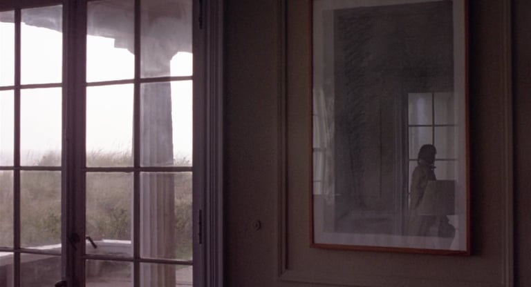
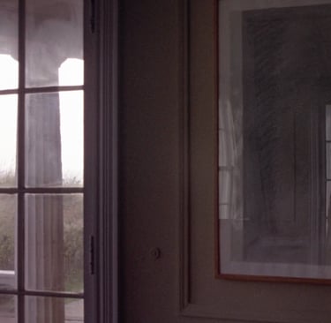
Interiors, directed by Woody Allen
What did you just feel during this pause? And you knew it’s about to be over, what if you didn’t? That’s what people feel watching that opening moment of Interiors.
Then there’s a cut. Another still angle. This one’s about five seconds. Then another: eight seconds. And now, imagine being in a theater. You can’t skip ahead or click away. You're stuck with it. I’ve shown this scene to students over the years, and a lot of them say it’s hard to stay focused.
But you’re not just sitting there bored. You’re actually doing something. You’re scanning the image, hunting for meaning. Because even if we don’t say it out loud, we know—someone created this image for a reason. Someone decided how to frame it, what to include, where to place things. That’s composition. We’ve talked before about how much intention goes into that, and whether people are aware of it or not, they sense it.
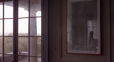
So during those first shots in Interiors, your brain kicks into gear. Why are we here? What’s happening? What’s going to happen next? And then, finally, comes the fourth shot. Something moves. Not the camera—inside the shot itself. A reflection in a picture frame. A figure moves across it, barely visible. But your eye catches it instantly. That’s just how we’re wired. Movement grabs our attention. It helped our ancestors spot danger, and that instinct hasn’t changed. But it’s not just movement that stands out, it’s movement against stillness. That contrast is what really draws your eye. So just from the first few shots of Interiors we already learned so much.
Now let me take you to a very different kind of film: The Hunger Games. It’s known for quick, shaky camera work and fast cuts. I usually show a scene from this one right after discussing Interiors—just to show the contrast.
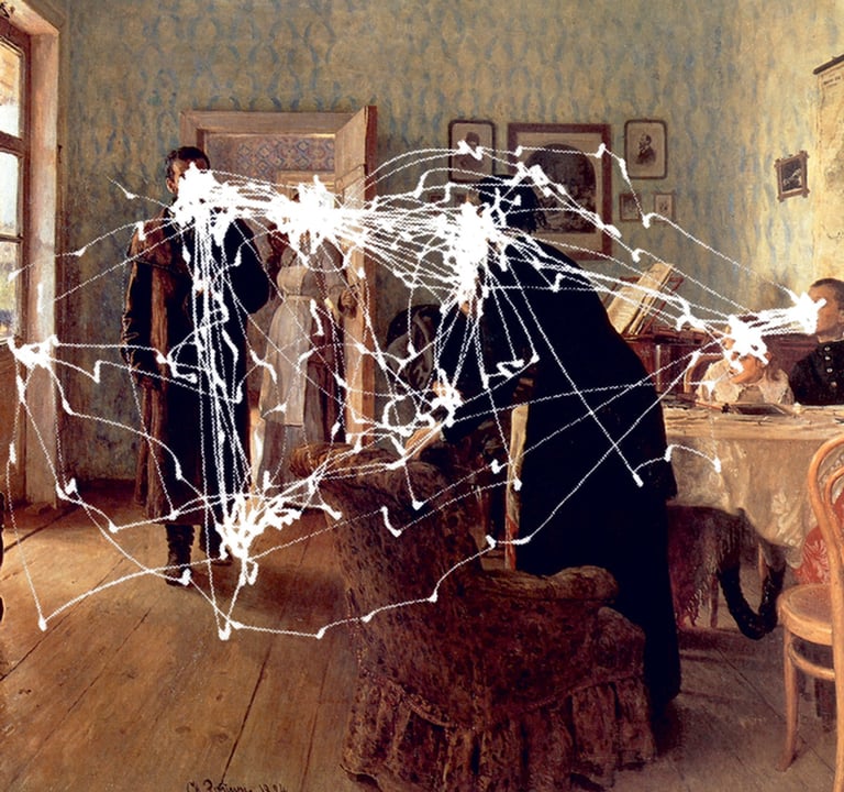
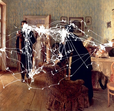
The Visitor, by Ilya Repin
Example from Yarbus' eye tracking experiment


Example 1 (silent)
Example 1 (with sound)
This is a transcript from Visium: The Secret Language of Images. Listen to the episode below:
Do you like going to museums? I certainly do. We walk through the galleries, stop in front of paintings, look at brushstrokes, and try to absorb the work. But here’s a question—how long do you think people actually spend looking at art in a museum?

People at The Met
According to several studies done over the last 20 years, the average time someone spends observing a single work of art is… about 25 seconds. Yep, that’s it.
When you think about how long painters spend creating those works, sometimes months, even years, that number feels a little short. And we thought filmmakers had it rough!
Now shift that idea over to film. When most people hear "movement" in filmmaking, they usually think of the gear—dollies, Steadicams, cranes. We’re trained to think about the tools. But this series isn’t about gear—it’s about the why behind using it. And with movement, it comes down to something more basic: time.
Because camera movement isn’t just about going from point A to point B. How fast or slow that movement happens controls the viewer’s experience—what they feel, when they feel it, and how long they’re invited to stay in a moment.
Sound interesting? Good—because that’s exactly what we’ll dive into next. I’m Tal Lazar, and this is Visium—where we explore images and figure out what makes them work. In this first series, we’re focusing on the images you see in movies.
The biggest difference between looking at a photograph and watching a scene in a movie comes down to control. When you’re standing in front of a photo at a museum for 25 seconds, you can walk away anytime. You chose to stop and look. Movies work differently. You agree, at least for a little while, to give up that control. Sure, you can leave, but it usually takes something really off-putting to make you walk out. Or maybe just too much soda. Either way, the director expects that you're watching, and they use that time to control the experience.
That’s not how it works with social media. There, creators know they’re in a constant battle for your attention. Be boring for a split second, and your audience is already onto the next thing. A movie director, on the other hand, can count on you sticking around, for a bit, at least, and that gives them room to tell a story over time.
So what do filmmakers actually do with that time they have? Let’s start with movies that treat images more like photographs—no camera movement at all. Of course, there are still differences, like soundtracks and editing, but each shot stays still, almost like a photo.
To fully understand movement, we need to do the same thing we did with everything else. Look at our own reaction. What do you think about? Where are you looking?
Take Woody Allen’s Interiors for example. It opens with a static shot of an empty living room in a beach house. No music, no dialogue. Just silence. You’re looking at that shot for about eight seconds. And yeah, that’s longer than it sounds. This is 8 seconds (close your eyes and count to 8).
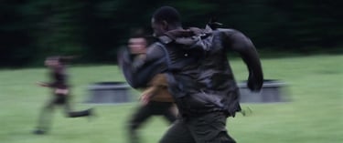
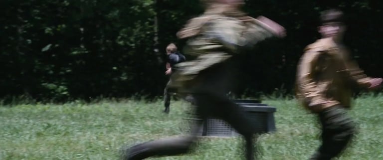
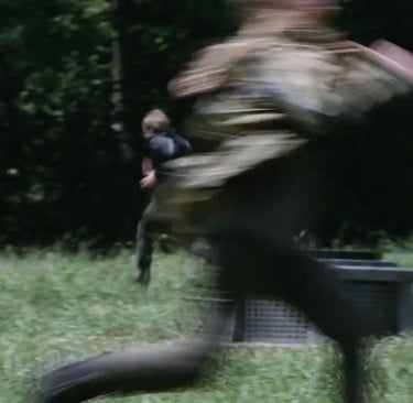
The Hunger Games, directed by Gary Ross
In some scenes in The Hunger Games, you never get a break. The shots come fast—so fast that before you can take in anything beyond the main subject, the image is gone. It’s like someone throwing information at you before you’ve had a chance to process the last thing they said. And that pace keeps going for minutes at a time. In some scenes, the average shot lasts less than a second.
It’s overwhelming. You feel off-balance, like your brain can’t quite keep up. But that’s what the main character is feeling too. She’s been thrown into a chaotic, violent game, and everything is happening at once, just like it is for us. That sense of confusion? That’s the point. It’s not just style, it’s storytelling.
In The Hunger Games, you don’t get time to explore. Watching it is more like that scene in Kubrick’s A Clockwork Orange—the one where a guy’s eyes are forced open so he can’t look away. After a while, it’s exhausting.
Now compare that to Interiors. There, the audience has time. We’re invited to slow down, explore the image, and search for meaning. But that comes with its own challenge. If there’s nothing to find, or if we’re left alone with an image for too long, we get tired in a different way.
So now we’re ready to talk about movement. Actually, we’re also ready to talk about editing. Because when we ask, “When should the camera move? When do we cut?” we’re really asking something deeper: How long should we let the viewer stay with an image? What are they doing with that time?
To explore that, we need to understand what’s happening in the viewer’s mind while they’re watching. And from looking at these two very different films, we’re starting to get a clearer idea.
Alfred Yarbus was a Soviet psychologist who studied eye movements back in the 1950s and '60s. He’s well known for his experiments on how and where people look when they examine an image. Now, this was long before we had the kind of fancy eye-tracking tech we use today. Let’s just say it involved suction cups and leave it at that. His findings turned out to be incredibly useful for filmmakers.
Take a second and think about it—what makes someone look at one part of an image over another? Most filmmakers would probably say the eye goes to the brightest spot, or that people focus on faces first. I was taught that too. I spent years assuming design elements like brightness, contrast, or leading lines controlled where the audience looked. And those things do matter—but they’re actually not the biggest factor.
Yarbus showed people a painting called The Visitor and tracked their eye movements. If you look it up, you’ll find Yarbus’ versions of the image, showing the lines drawn across that image where people’s eyes traveled. What he found was surprising: when people looked at the painting without any instructions, yes, they tended to look at the people in the image first. But it wasn’t just because they were faces or humans. It was because viewers were trying to figure out the story—what’s going on in this scene?
Yarbus took it a step further. He gave viewers little prompts or questions before they looked at the painting for the first time. If he asked them to think about class or wealth, they started looking closely at the characters' clothes and examine the space. If he mentioned a long journey, people focused on the visitor’s bag. So it wasn’t the image alone that guided the eye, but what the viewer was thinking about. The questions in their head shaped how they looked.
In movies, this happens all the time. The story itself raises those questions. We don’t always tell viewers where to look directly, but we guide them by setting up what to care about, and those questions lead the eye.
There’s a fascinating research project out of the UC Davis Visual Cognition Lab called the DIEM project—short for Dynamic Images and Eye Movements. They’ve done a lot of work tracking where people look while watching video, and one of the standout examples comes from a scene in Paul Thomas Anderson’s There Will Be Blood.
In the scene, a young man walks into a room and meets two others. In the DIEM project’s version of the scene you can actually see viewers’ eyes, represented by dots on the screen, scanning the space. It’s like they’re asking: Where are we? Who is this person? What’s about to happen? Then, once the characters start talking, something really interesting happens. Before one man even finishes a question, the audience’s eyes jump over to the other person, anticipating a response. You can actually track the thought process of the viewer through their gaze. It’s like watching a conversation unfold not just between the characters, but between the film and its audience.
So what does this have to do with camera movement?
Now that we understand what the audience is doing while watching, how they take in information, we can start making more thoughtful decisions about where, when, and why to move the camera. We can also better decide when to cut, or when to let something new enter the frame without cutting.
One great example of this kind of intentional camera movement is the opening of Léon: The Professional. The entire sequence controls how we take in information, step by step. The shot begins with a pair of dangling feet in heavy leather boots. The camera slowly moves up—and now we see colored tights. That’s surprising. Oh, it’s a child. Then the camera moves higher and we see a hand holding a cigarette. That raises new questions. How old is this child? What’s going on here? Finally, the camera reaches her face, leaning against metal bars. She’s young—but now we understand more. In just one shot, we learn that she feels trapped, that she’s had to grow up too soon. The layering of images builds meaning. The impact is greater than the sum of the parts. And all of that comes from knowing how the audience watches, and using the camera to guide them through the story, one piece at a time.

Léon: The Professional, directed by Luc Besson
So how would that scene in Léon: The Professional feel different if, instead of using a moving camera, it was made up of separate cuts? Well, every time a cut happens, something important takes place in the viewer’s mind. The first thing we do is reorient ourselves. Even though it only takes a fraction of a second, we still have to figure out where we are now. After that, we apply what we already know to this new shot. It’s no longer just a generic question like “What’s happening?” Instead, it becomes more specific—“How does this new piece fit into what I’ve already seen?”
Also, whether we realize it or not, we treat the cut itself as a kind of cue. A hint. The filmmaker is quietly saying, “Look here. This matters.” And because we’ve learned to think that way, we assume something’s changed with each cut. That something’s worth noticing. If, as a filmmaker, you cut too much—especially without a good reason—the audience starts to feel it. It starts to feel mechanical, maybe even annoying. That’s why every cut really needs to move the story forward. Unless, of course, you’re intentionally trying to slow things down.
Now, with camera movement, something different happens. There’s no sudden reorientation. We stay grounded, right there in the space. We’re just slowly discovering more. Yes, camera movement can still draw attention to itself—sometimes even more than a cut—but it works differently depending on how it’s used.
That’s where the idea of motivated versus unmotivated camera movement comes in. Motivated movement follows something happening on screen—a character turning their head, someone walking into the frame, a car driving by. Instead of leading us, the camera follows our existing curiosity. It aligns naturally with where our eyes and minds want to go. When that happens, movement feels almost invisible. It feels natural, like we wanted to go there anyway. And that’s the trick. It feels like it just happened, but of course, everything is carefully planned.
Unmotivated camera movement is when the camera moves without following any visual on-screen cue. There’s no character to follow, no action on screen prompting it—it just moves. And for the audience, that can be distracting if there’s no narrative context to support it.
When I explain this to students, I show them a shot I filmed from a rooftop, looking over a city. It’s a calm view, and then suddenly, the camera shakes. Most students say it pulls them out of the moment. They think something went wrong with the equipment. But then I play the same shot again, only this time, just before the shake, there’s a loud explosion. Suddenly, no one’s confused. The camera still isn’t following anything we can see (it’s technically still unmotivated) but the movement makes sense now because there’s story behind it. That’s the key. Even unmotivated movement can feel natural if the context is right.

Raise the Red Lantern, directed by Zhang Yimou
It's a little confusing, I know. But this is how the term is used in filmmaking. And if you want to communicate clearly with camera crews, especially on set, it helps to understand that "unmotivated" just means the camera isn’t reacting to something visible in the frame—it’s not a judgment call about whether the movement works or not.
Another thing that can really shape how a camera move feels is when it starts in the shot. If the camera stays still at first, and then starts moving, there’s a shift—a contrast between stillness and motion. That change can build tension, create emphasis, or add drama. But it can also pull attention in a way that’s jarring if it's not handled carefully. If the camera moves right after a cut, then the effect is different.
So you can see, there are a lot of levers you can pull with camera movement—and we haven’t even gotten into how the camera moves. Whether you're using a dolly, a drone, or a gimbal… that part comes later. What matters first is why you’re moving the camera, when you start moving it, how fast it moves, and what the viewer knows when it happens. That's the real storytelling work.
To fully understand movement, we need to do the same thing we did with everything else. Look at our own reaction. What do you think about? Where are you looking? Are you feeling anything? After finding that out, we can check and see how camera movement assisted, or prevented, anything.
At the core, movement has several functions:
Revealing information at a certain pace. We saw that in all of the examples I gave up to this point. Even in The Hunger Games, where the audience is prevented from exploring the world too much
Create an experience with the movement itself. In Interiors we felt trapped. That’s exactly what the character who starts narrating the opening scene, talks about. In The Hunger Games we felt disoriented. Again, that’s the character’s experience.
Emphasize and direct attention. We saw this in Interiors in the reflection in the picture frame, and also in The professional where our attention was assisted by the movement.
Act as a design element. Much like any design element, it’s possible to tie meaning to movement and use contrast between movement and stillness to say something. In Cast Away, the movie starts with a lot of movement, and when the hero’s plan crashes on an island, the shots are long and still. Imagine cutting from The Hunger Games to Interiors. It requires very different engagement from the audience, and that directly affects what we know and feel about the character and the world.
And finally, movement is a strong depth cue. Next time your driving in a car, look to the side. I mean, only do it if you’re not the one driving. You’ll see that objects closer to you appear moving faster than objects far away. Animator use this to give a sensation of depth, disney used it in the past by moving glass plates in front of the camera at different speeds.
So next time you think about moving the camera, hopefully this will give you something to think about when and how to move it. This concludes episode 14, and as we are definitely over the half way mark for this series, I think it’s time to open a whole new world to explore: lighting. And that’s what we’ll start doing next time. If you're enjoying this journey, make sure to subscribe, leave a review, and join me next time as we keep exploring how filmmakers bring images—and stories—to life.
If you have any thought, an example that wasn’t mentioned or a question, feel free to reach out—just email tal@cinematicimpact.com. You can also check out my book at TheLanguageofCinematography.com.
Thanks for spending time with me today. Goodbye!
There Will Be Blood eye tracking, by the DIEM Project

Interiors, directed by Woody Allen
What did you just feel during this pause? And you knew it’s about to be over, what if you didn’t? That’s what people feel watching that opening moment of Interiors.
Then there’s a cut. Another still angle. This one’s about five seconds. Then another: eight seconds. And now, imagine being in a theater. You can’t skip ahead or click away. You're stuck with it. I’ve shown this scene to students over the years, and a lot of them say it’s hard to stay focused.
But you’re not just sitting there bored. You’re actually doing something. You’re scanning the image, hunting for meaning. Because even if we don’t say it out loud, we know—someone created this image for a reason. Someone decided how to frame it, what to include, where to place things. That’s composition. We’ve talked before about how much intention goes into that, and whether people are aware of it or not, they sense it.
So during those first shots in Interiors, your brain kicks into gear. Why are we here? What’s happening? What’s going to happen next? And then, finally, comes the fourth shot. Something moves. Not the camera—inside the shot itself. A reflection in a picture frame. A figure moves across it, barely visible. But your eye catches it instantly. That’s just how we’re wired. Movement grabs our attention. It helped our ancestors spot danger, and that instinct hasn’t changed. But it’s not just movement that stands out, it’s movement against stillness. That contrast is what really draws your eye. So just from the first few shots of Interiors we already learned so much.
Now let me take you to a very different kind of film: The Hunger Games. It’s known for quick, shaky camera work and fast cuts. I usually show a scene from this one right after discussing Interiors—just to show the contrast.

The Visitor, by Ilya Repin
Example from Yarbus' eye tracking experiment


Example 1 (silent)
Example 1 (with sound)