Expression with Color
Newton’s revelation that white light contains every hue ignited centuries of research into both the physics of light and the quirks of human vision. Our eyes adjust constantly to maintain color constancy, sometimes producing after-images or letting rare tetrachromats see a richer spectrum. Filmmakers use those perceptual effects through careful color grading and bold palettes to guide emotion and focus, showing why an understanding of color is vital for anyone shaping images.
This is a transcript from Visium: The Secret Language of Images. Listen to the episode below:
The year is 1666, and the place is a dorm room at Trinity College in Cambridge. But the university is shut down because of the Great Plague of London. Everyone’s stuck in quarantine. Like in COVID, but just after the Middle Ages, so no modern medicine, no masks, and not much understanding of germs, which weren’t even discovered until about a decade later.

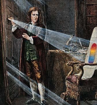
Sir Isaac Newton experimenting with a prism. Engraving after a picture by J.A. Houston, ca. 1870.
In that dorm room, a 23-year-old student who had just finished his undergraduate degree was running an experiment. That student was Isaac Newton, and he was trying to figure out a question that might sound simple but actually had top scientists thinking for centuries: What is color?
At the time, most people believed color came from impurities in the air or in glass when light is passed through it. It was an idea that went all the way back to Aristotle. Newton thought it might be time to take another look at this. Can’t blame him, we all did some weird things during the pandemic to pass the time.
So, in a dark room, he set up a piece of glass, what we now call a prism, and let a beam of sunlight pass through it. On the wall, a rainbow appeared, spreading out into the full spectrum of colors. Now, this wasn’t a new thing. People had seen light do this before, but they thought the glass somehow added the colors. Newton didn’t stop there. He took a second prism and passed that rainbow light through it again. The result? The colors came back together into white light. That proved that white light actually contains all the colors mixed together.
At the time, this idea was so radical that Newton waited years before publishing it. It’s kind of wild when you think about it: something as basic as color, something we see every day, was misunderstood for so long.
And there’s still something mysterious about it. Like, how do we know we’re all seeing the same thing? That question really got to me as a kid. When I look at red, is it the same red you see? Or are we all just assuming we’re seeing the same thing?
The truth is, not everyone sees color the same way. And today, we’re going to dive into how color works in images. But before we do that, we need to understand how the eye actually sees color in the first place. Inside our eyes, we have special cells called color receptors, or cones. Most people have three types—one for red, one for green, and one for blue. These cones work together to help us see the full range of colors by mixing those three.
Rods and Cones in the retina
But some people are different. They have a rare condition called tetrachromacy, which means they have a fourth type of color receptor. That extra cone can pick up on a wider range of colors—so they actually see colors most of us can’t. Pretty wild, right? They’re living in a slightly different color world than the rest of us.
So, yeah there’s so much to talk about when it comes to color. I’m Tal Lazar, and this is Visium—where we explore images and figure out what makes them work. In this first series, we’re focusing on the images you see in movies.
Color is the only design element that can affect us in a physical way. When we see color, our bodies actually respond. Want proof? Try this simple experiment. Take anything that is a bright color, say, a bold red, and also a plain white sheet of paper. Look at the red for about 30 seconds without moving your eyes. Then quickly shift your eyes to the white paper. You'll see a faint after-image in a different color that fades after a few seconds.
Color is the only design element that can affect us in a physical way. When we see color, our bodies actually respond.
It’s a small trick, but it has big implications for filmmakers. After all, where else do we look at one image for a while and quickly transition to another? In movies, of course. Filmmakers can use this natural response on purpose to control how we feel from shot to shot.
And it goes even deeper. If just looking at a single color for a few seconds can change what we see next, then imagine how it affects us when we’re watching a whole movie. Not just as audience members, either, think about how this plays out on set for the crew watching a monitor or in a color grading session in post. OK so, let’s take a step back and ask the basic question: What is color?
Color is light—and light is color. Without going too deep into the science, light is made of waves, each with a different length. Just like radio waves or microwaves, light waves are a type of energy that can travel through space. Our eyes pick up these different wavelengths, and each one appears as a different color.
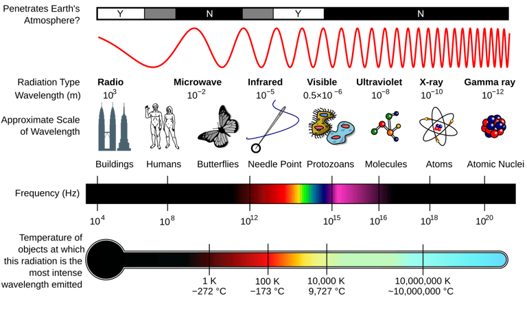
Electro-Magnetic Radiation waves
The part of light we can actually see is called the visible spectrum. Shorter wavelengths look blue or violet—go even shorter and you get ultraviolet, which we can’t see. Longer wavelengths appear red, and beyond that is infrared, also invisible to us.
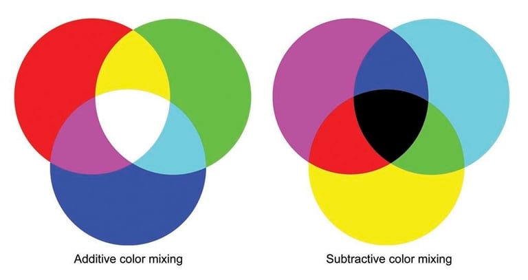
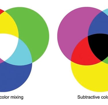
When we talk about color in light, it's called additive color—because you're adding light together to create new colors. For example, if you shine red and green lights together, the result looks yellow. Don’t believe it? You can try it yourself using flashlights and colored filters. It’s totally different from mixing paint. If you mix red and green paint, you’d get a muddy brown or gray. That’s because paint deals with subtractive color. Physical objects don’t emit light—they reflect some and absorb the rest. Take a green leaf. Why do we see it as green? The sunlight hitting it contains all colors, but the leaf absorbs some of them and reflects just the green wavelengths. So instead of adding light, the colors are created by subtracting parts of it.
Pretty simple so far. But this still doesn't explain why we see an after-image when we stare at a color like red for a few seconds. For that, it’s not enough to understand color, we need to look at how the eye works.
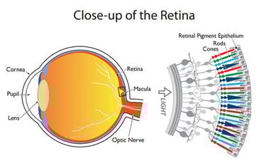
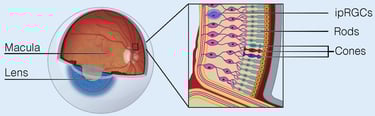
The human eye is a pretty amazing system. It has a lens up front that focuses light to the back of the eye, onto the retina. Think of the retina like a digital camera sensor, it’s covered in light-sensitive cells. These cells come in two types: rods and cones—and they’re named for their shape. They play a big role in how we see both light and color.
The Retina
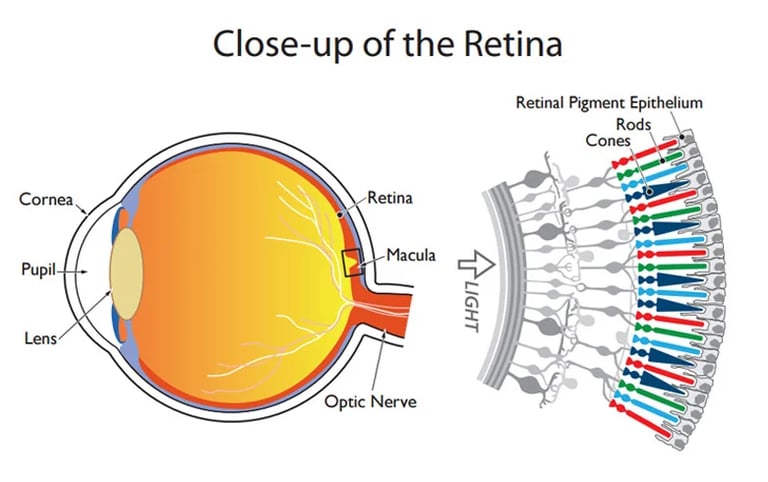
Rod cells make up most of the retina—around 120 million in each eye. They aren’t really built for seeing color. But if you've been paying attention, you know it's not accurate to say they don’t see color at all. Because light is color, rods still see a narrow part of the visible spectrum, mostly in the blue-green range.
Rods are great for low-light vision, which is why we rely on them at night. But they can’t see fine detail very well, and they’re not good with color differences. That’s why, in the dark, it’s hard to tell a red sweater from a purple one—or read a sign from far away.
Cone cells, on the other hand, are all about detail and color. There are only about 6 to 7 million of them (far fewer than rods) and they’re packed tightly into a small section of the retina. They need more light to work than rods. There are three types of cone cells, each sensitive to different parts of the spectrum: red, green, and blue. Since they’re concentrated in one part of the retina, we have to move our eyes to focus that part directly on whatever we want to see in detail. That’s why your peripheral vision is great for spotting movement, like a car coming down the road, but not for reading the license plate. Rods handle the wide shots, cones handle the close-ups.
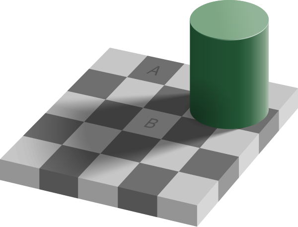
Now, here’s something most people don’t realize: your eyes (or more accurately, your entire visual system) aren’t just passively showing you the world as it is. They’re actively adjusting what you see to help you make sense of it. The goal isn’t accuracy—it’s to be useful. Think about looking at an apple. You want to know if it’s ripe, right? It wouldn’t help if its color changed drastically depending on whether you’re indoors, outside, by a fire or under the sun. So your visual system does something called color constancy. It’s kind of like your brain’s built-in version of white balance. It keeps colors looking more or less the same, even when the lighting changes.
You might already know about white balance from using a camera. Different kinds of light have different colors—daylight tends to be more blue, and artificial lighting is usually warmer, more yellow or orange. But when we take photos or shoot video, we usually want the colors to look neutral—so that a white sheet of paper actually looks white, no matter what kind of light it's under. That’s what white balance is for. It tells the camera what “neutral” looks like in a given lighting situation, and shifts all the other colors accordingly.
Consumer cameras adjust white balance automatically, but sometimes they struggle, especially in mixed lighting. For instance, in the evening when daylight is fading outside but lamps are turned on inside, the camera might see the outside s blue and the inside as warm or orange. The result can look a little strange.
Amazingly, something similar happens with our eyes. Our visual system is constantly working to balance colors in the same way a camera does. That’s color constancy. And to pull it off, the brain adds colors the same way you would in color correction. Imagine you're the brain. You're seeing a scene that looks really red or warm-toned. Your goal is to make it look neutral. How would you do that? Right—you’d try to cool it down by adding its opposite. In this case, that would be more blue.
What the brain actually does is add complementary colors—those are colors that, when combined, produce white light. Think back to the green leaf: we see green because the leaf reflects green light and absorbs its complementary color, which is magenta. If you mix green and magenta light, you get white.
That’s exactly what’s happening with the after-image effect. Let’s say you stare at something red for a while. Your brain goes, “Whoa, too much red—let’s balance this out,” and starts adding cyan, the complementary color to red. But then you quickly switch to a white paper. All the red is gone—but the cyan your brain added is still hanging around for a few seconds. That lingering color is your after-image.
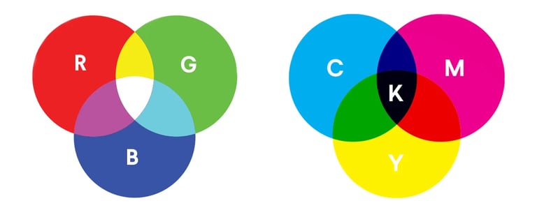
All of this is pretty cool—but maybe you’re thinking, “Wait, cyan is the complementary color of red? I thought it was green.” You’re not wrong. Complementary colors can be a bit tricky, because they actually depend on the color model you’re using—like light vs. paint.
Before Newton’s experiment with light and prisms, scientists were already trying to figure out how to make colors using paint. Back then, they came up with a system based on three primary colors: Red, Yellow, and Blue. In this model, red and green are considered complementary, because mixing blue and yellow (two of the primary colors in this model), creates green. But as science moved forward, especially in how we understand light, new models developed.
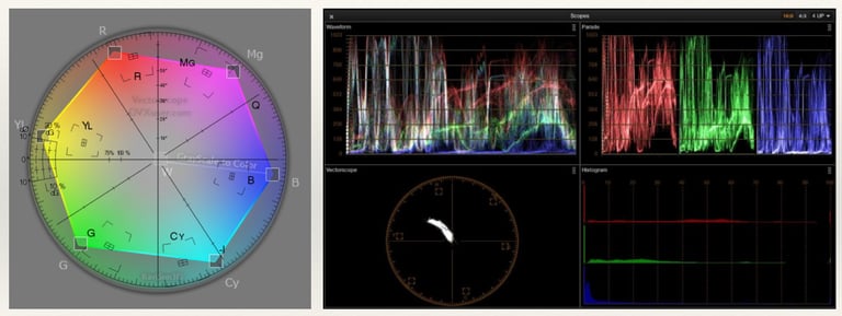
Video scopes used on set and in post-production
Today, we use the RGB model to describe how color works in light—red, green, and blue are the primary colors. In this model, the complementary colors are different. For printing and working with paint, we use CMYK: Cyan, Magenta, Yellow, and Black. So why the extra “K” for black? Well, if you’ve ever printed something text-heavy, you know it wouldn’t be very efficient to use three colors of ink just to make black letters. Also, mixing cyan, magenta, and yellow doesn’t create a true black—it gives you a muddy gray. Adding black ink gets you a deeper, cleaner result.
So far we've covered a lot: how light works, color as additive and subtractive, rods and cones in the eye, color constancy, complementary colors and now color models like RGB and CMYK. It’s a lot to take in. So how does all this information help you when you're actually working on a film?
Let’s say you're in post, working with your colorist on a scene that’s very blue. You sit in the grading room, the first shot comes up, and you start dialing in just the right shade of blue. Then you move on to the next shot, and the next. What eventually happens to your eyes?
Your brain, doing its usual thing, decides you’ve been staring at too much blue and starts compensating using color constancy—basically trying to “neutralize” all the blue. So colors start looking less blue to you, even though the actual image hasn’t changed. What’s your instinct? You add more blue to “bring it back.” But what you’ve done is gradually increase the blue over time—without even realizing it.
That’s why professional colorists have systems in place to avoid this kind of shift. First, they pick a single shot to act as a reference—not always the first shot, usually one that best represents the look of the whole scene, like a clean wide shot. Once they get that reference shot just right, they color match the rest of the shots to it, going back and forth.
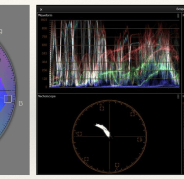
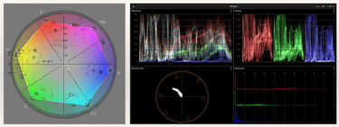
Colorists also rely on scopes, like the waveform and vectorscope. These tools give you a visual readout of color and brightness, so you’re not just going by what your eyes are saying—which, as we now know, can be influenced over time. And finally, they take breaks. Giving your eyes a chance to rest and reset helps you come back with a clearer, more accurate view of the scene.
So even though the science behind color and perception is complex, knowing how it works gives you more control as an image maker. And that can make a big difference in how your story is seen—and felt.
If you’ve ever spent time in a professional color correction suite, you might’ve noticed something interesting—the room isn’t completely dark, but the lighting is very dim. The lights that are on are carefully matched to the monitor’s white point to keep your eyes from getting thrown off. Even the walls are painted a specific shade of neutral gray. All of this is done to help you and your colorist see color as accurately as possible.
But these principles don’t only apply in a color suite. They matter on set too—especially when you're watching a monitor. And yes, watching a monitor is a skill. If someone looks at it without understanding how our eyes work, it can be really misleading. One big factor is adaptation. Your eyes take time to adjust from one lighting condition to another. So if you’re coming from a bright exterior set into a dark tent to check the monitor, your eyes won’t be ready right away. In fact, for them to fully adapt, it can take up to 30 minutes. That’s something worth keeping in mind when reviewing color and images on set. A DIT can really help here.
Now earlier, I said all this isn’t just technical—it can be used creatively too. And if you’ve never seen the film Raise the Red Lantern, I’m honestly jealous. Zhang Yimou uses color in stunning and deliberate ways.
Set in 1920s China, there’s a scene where Songlian, the film’s main character, is waiting to meet her new husband for the first time. The scene starts outside in a cool, blue evening. We stay in that space for a few moments before a cutting to the inside, where the lighting is suddenly warm. That shift, going from blue abruptly to warm, makes the interior feel warmer than it really is, and it matches what Songlian is feeling: very anxious. Then, as the scene progresses and the tension builds, something else starts to stand out—the color red. It becomes more vivid. What in the beginning felt red turns out to be just a pale version of what’s coming later.


Raise the Red Lantern, directed by Zhang Yimou
So the film uses two types of color contrast. The first is a contrast of hue—placing two colors side by side or back to back, like blue and orange, to create emotional or visual intensity. The second is contrast of saturation—starting with a muted red and then shifting to a bold, saturated red for a dramatic effect.
Using color in composition isn’t just about painting things with pretty colors. It’s about how colors relate to each other, how they contrast, and what kind of response that creates in the viewer. And that’s exactly where we’re headed next. In the next episode, we’ll talk about different types of color contrast and how filmmakers use them to build emotion, and meaning.
If you're enjoying this journey, make sure to subscribe, leave a review, and join me next time as we keep exploring how filmmakers bring images—and stories—to life.
If you have any thought, an example that wasn’t mentioned or a question, feel free to reach out—just email tal@cinematicimpact.com . You can also check out my book at TheLanguageofCinematography.com.
Thanks for spending time with me today. Goodbye!
Constancy makes square A appear darker than square B, when in fact they are both exactly the same shade of gray.

This is a transcript from Visium: The Secret Language of Images. Listen to the episode below:
The year is 1666, and the place is a dorm room at Trinity College in Cambridge. But the university is shut down because of the Great Plague of London. Everyone’s stuck in quarantine. Like in COVID, but just after the Middle Ages, so no modern medicine, no masks, and not much understanding of germs, which weren’t even discovered until about a decade later.
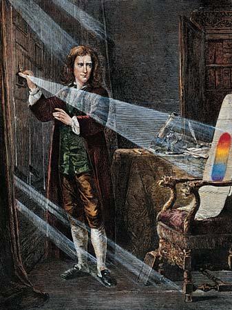
Sir Isaac Newton experimenting with a prism. Engraving after a picture by J.A. Houston, ca. 1870.
In that dorm room, a 23-year-old student who had just finished his undergraduate degree was running an experiment. That student was Isaac Newton, and he was trying to figure out a question that might sound simple but actually had top scientists thinking for centuries: What is color?
At the time, most people believed color came from impurities in the air or in glass when light is passed through it. It was an idea that went all the way back to Aristotle. Newton thought it might be time to take another look at this. Can’t blame him, we all did some weird things during the pandemic to pass the time.
So, in a dark room, he set up a piece of glass, what we now call a prism, and let a beam of sunlight pass through it. On the wall, a rainbow appeared, spreading out into the full spectrum of colors. Now, this wasn’t a new thing. People had seen light do this before, but they thought the glass somehow added the colors. Newton didn’t stop there. He took a second prism and passed that rainbow light through it again. The result? The colors came back together into white light. That proved that white light actually contains all the colors mixed together.
At the time, this idea was so radical that Newton waited years before publishing it. It’s kind of wild when you think about it: something as basic as color, something we see every day, was misunderstood for so long.
And there’s still something mysterious about it. Like, how do we know we’re all seeing the same thing? That question really got to me as a kid. When I look at red, is it the same red you see? Or are we all just assuming we’re seeing the same thing?
The truth is, not everyone sees color the same way. And today, we’re going to dive into how color works in images. But before we do that, we need to understand how the eye actually sees color in the first place. Inside our eyes, we have special cells called color receptors, or cones. Most people have three types—one for red, one for green, and one for blue. These cones work together to help us see the full range of colors by mixing those three.

Rods and Cones in the retina
But some people are different. They have a rare condition called tetrachromacy, which means they have a fourth type of color receptor. That extra cone can pick up on a wider range of colors—so they actually see colors most of us can’t. Pretty wild, right? They’re living in a slightly different color world than the rest of us.
So, yeah there’s so much to talk about when it comes to color. I’m Tal Lazar, and this is Visium—where we explore images and figure out what makes them work. In this first series, we’re focusing on the images you see in movies.
Color is the only design element that can affect us in a physical way. When we see color, our bodies actually respond. Want proof? Try this simple experiment. Take anything that is a bright color, say, a bold red, and also a plain white sheet of paper. Look at the red for about 30 seconds without moving your eyes. Then quickly shift your eyes to the white paper. You'll see a faint after-image in a different color that fades after a few seconds.
Color is the only design element that can affect us in a physical way. When we see color, our bodies actually respond.
It’s a small trick, but it has big implications for filmmakers. After all, where else do we look at one image for a while and quickly transition to another? In movies, of course. Filmmakers can use this natural response on purpose to control how we feel from shot to shot.
And it goes even deeper. If just looking at a single color for a few seconds can change what we see next, then imagine how it affects us when we’re watching a whole movie. Not just as audience members, either, think about how this plays out on set for the crew watching a monitor or in a color grading session in post. OK so, let’s take a step back and ask the basic question: What is color?
Color is light—and light is color. Without going too deep into the science, light is made of waves, each with a different length. Just like radio waves or microwaves, light waves are a type of energy that can travel through space. Our eyes pick up these different wavelengths, and each one appears as a different color.
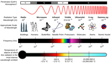
Electro-Magnetic Radiation waves
The part of light we can actually see is called the visible spectrum. Shorter wavelengths look blue or violet—go even shorter and you get ultraviolet, which we can’t see. Longer wavelengths appear red, and beyond that is infrared, also invisible to us.
When we talk about color in light, it's called additive color—because you're adding light together to create new colors. For example, if you shine red and green lights together, the result looks yellow. Don’t believe it? You can try it yourself using flashlights and colored filters. It’s totally different from mixing paint. If you mix red and green paint, you’d get a muddy brown or gray. That’s because paint deals with subtractive color. Physical objects don’t emit light—they reflect some and absorb the rest. Take a green leaf. Why do we see it as green? The sunlight hitting it contains all colors, but the leaf absorbs some of them and reflects just the green wavelengths. So instead of adding light, the colors are created by subtracting parts of it.
Pretty simple so far. But this still doesn't explain why we see an after-image when we stare at a color like red for a few seconds. For that, it’s not enough to understand color, we need to look at how the eye works.
The human eye is a pretty amazing system. It has a lens up front that focuses light to the back of the eye, onto the retina. Think of the retina like a digital camera sensor, it’s covered in light-sensitive cells. These cells come in two types: rods and cones—and they’re named for their shape. They play a big role in how we see both light and color.
The Retina
Rod cells make up most of the retina—around 120 million in each eye. They aren’t really built for seeing color. But if you've been paying attention, you know it's not accurate to say they don’t see color at all. Because light is color, rods still see a narrow part of the visible spectrum, mostly in the blue-green range.
Rods are great for low-light vision, which is why we rely on them at night. But they can’t see fine detail very well, and they’re not good with color differences. That’s why, in the dark, it’s hard to tell a red sweater from a purple one—or read a sign from far away.
Cone cells, on the other hand, are all about detail and color. There are only about 6 to 7 million of them (far fewer than rods) and they’re packed tightly into a small section of the retina. They need more light to work than rods. There are three types of cone cells, each sensitive to different parts of the spectrum: red, green, and blue. Since they’re concentrated in one part of the retina, we have to move our eyes to focus that part directly on whatever we want to see in detail. That’s why your peripheral vision is great for spotting movement, like a car coming down the road, but not for reading the license plate. Rods handle the wide shots, cones handle the close-ups.
Now, here’s something most people don’t realize: your eyes (or more accurately, your entire visual system) aren’t just passively showing you the world as it is. They’re actively adjusting what you see to help you make sense of it. The goal isn’t accuracy—it’s to be useful. Think about looking at an apple. You want to know if it’s ripe, right? It wouldn’t help if its color changed drastically depending on whether you’re indoors, outside, by a fire or under the sun. So your visual system does something called color constancy. It’s kind of like your brain’s built-in version of white balance. It keeps colors looking more or less the same, even when the lighting changes.
You might already know about white balance from using a camera. Different kinds of light have different colors—daylight tends to be more blue, and artificial lighting is usually warmer, more yellow or orange. But when we take photos or shoot video, we usually want the colors to look neutral—so that a white sheet of paper actually looks white, no matter what kind of light it's under. That’s what white balance is for. It tells the camera what “neutral” looks like in a given lighting situation, and shifts all the other colors accordingly.
Consumer cameras adjust white balance automatically, but sometimes they struggle, especially in mixed lighting. For instance, in the evening when daylight is fading outside but lamps are turned on inside, the camera might see the outside s blue and the inside as warm or orange. The result can look a little strange.
Amazingly, something similar happens with our eyes. Our visual system is constantly working to balance colors in the same way a camera does. That’s color constancy. And to pull it off, the brain adds colors the same way you would in color correction. Imagine you're the brain. You're seeing a scene that looks really red or warm-toned. Your goal is to make it look neutral. How would you do that? Right—you’d try to cool it down by adding its opposite. In this case, that would be more blue.
What the brain actually does is add complementary colors—those are colors that, when combined, produce white light. Think back to the green leaf: we see green because the leaf reflects green light and absorbs its complementary color, which is magenta. If you mix green and magenta light, you get white.
That’s exactly what’s happening with the after-image effect. Let’s say you stare at something red for a while. Your brain goes, “Whoa, too much red—let’s balance this out,” and starts adding cyan, the complementary color to red. But then you quickly switch to a white paper. All the red is gone—but the cyan your brain added is still hanging around for a few seconds. That lingering color is your after-image.
All of this is pretty cool—but maybe you’re thinking, “Wait, cyan is the complementary color of red? I thought it was green.” You’re not wrong. Complementary colors can be a bit tricky, because they actually depend on the color model you’re using—like light vs. paint.
Before Newton’s experiment with light and prisms, scientists were already trying to figure out how to make colors using paint. Back then, they came up with a system based on three primary colors: Red, Yellow, and Blue. In this model, red and green are considered complementary, because mixing blue and yellow (two of the primary colors in this model), creates green. But as science moved forward, especially in how we understand light, new models developed.

Video scopes used on set and in post-production
Today, we use the RGB model to describe how color works in light—red, green, and blue are the primary colors. In this model, the complementary colors are different. For printing and working with paint, we use CMYK: Cyan, Magenta, Yellow, and Black. So why the extra “K” for black? Well, if you’ve ever printed something text-heavy, you know it wouldn’t be very efficient to use three colors of ink just to make black letters. Also, mixing cyan, magenta, and yellow doesn’t create a true black—it gives you a muddy gray. Adding black ink gets you a deeper, cleaner result.
So far we've covered a lot: how light works, color as additive and subtractive, rods and cones in the eye, color constancy, complementary colors and now color models like RGB and CMYK. It’s a lot to take in. So how does all this information help you when you're actually working on a film?
Let’s say you're in post, working with your colorist on a scene that’s very blue. You sit in the grading room, the first shot comes up, and you start dialing in just the right shade of blue. Then you move on to the next shot, and the next. What eventually happens to your eyes?
Your brain, doing its usual thing, decides you’ve been staring at too much blue and starts compensating using color constancy—basically trying to “neutralize” all the blue. So colors start looking less blue to you, even though the actual image hasn’t changed. What’s your instinct? You add more blue to “bring it back.” But what you’ve done is gradually increase the blue over time—without even realizing it.
That’s why professional colorists have systems in place to avoid this kind of shift. First, they pick a single shot to act as a reference—not always the first shot, usually one that best represents the look of the whole scene, like a clean wide shot. Once they get that reference shot just right, they color match the rest of the shots to it, going back and forth.
Colorists also rely on scopes, like the waveform and vectorscope. These tools give you a visual readout of color and brightness, so you’re not just going by what your eyes are saying—which, as we now know, can be influenced over time. And finally, they take breaks. Giving your eyes a chance to rest and reset helps you come back with a clearer, more accurate view of the scene.
So even though the science behind color and perception is complex, knowing how it works gives you more control as an image maker. And that can make a big difference in how your story is seen—and felt.
If you’ve ever spent time in a professional color correction suite, you might’ve noticed something interesting—the room isn’t completely dark, but the lighting is very dim. The lights that are on are carefully matched to the monitor’s white point to keep your eyes from getting thrown off. Even the walls are painted a specific shade of neutral gray. All of this is done to help you and your colorist see color as accurately as possible.
But these principles don’t only apply in a color suite. They matter on set too—especially when you're watching a monitor. And yes, watching a monitor is a skill. If someone looks at it without understanding how our eyes work, it can be really misleading. One big factor is adaptation. Your eyes take time to adjust from one lighting condition to another. So if you’re coming from a bright exterior set into a dark tent to check the monitor, your eyes won’t be ready right away. In fact, for them to fully adapt, it can take up to 30 minutes. That’s something worth keeping in mind when reviewing color and images on set. A DIT can really help here.
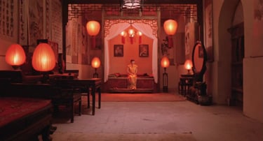
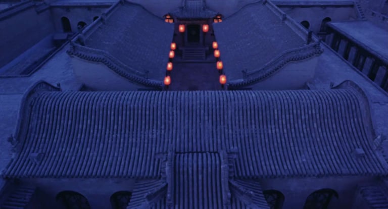
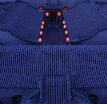
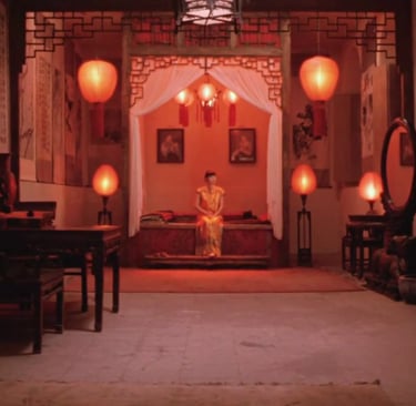
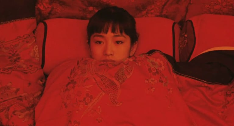
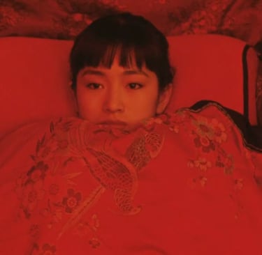
Now earlier, I said all this isn’t just technical—it can be used creatively too. And if you’ve never seen the film Raise the Red Lantern, I’m honestly jealous. Zhang Yimou uses color in stunning and deliberate ways.
Set in 1920s China, there’s a scene where Songlian, the film’s main character, is waiting to meet her new husband for the first time. The scene starts outside in a cool, blue evening. We stay in that space for a few moments before a cutting to the inside, where the lighting is suddenly warm. That shift, going from blue abruptly to warm, makes the interior feel warmer than it really is, and it matches what Songlian is feeling: very anxious. Then, as the scene progresses and the tension builds, something else starts to stand out—the color red. It becomes more vivid. What in the beginning felt red turns out to be just a pale version of what’s coming later.


Raise the Red Lantern, directed by Zhang Yimou
So the film uses two types of color contrast. The first is a contrast of hue—placing two colors side by side or back to back, like blue and orange, to create emotional or visual intensity. The second is contrast of saturation—starting with a muted red and then shifting to a bold, saturated red for a dramatic effect.
Using color in composition isn’t just about painting things with pretty colors. It’s about how colors relate to each other, how they contrast, and what kind of response that creates in the viewer. And that’s exactly where we’re headed next. In the next episode, we’ll talk about different types of color contrast and how filmmakers use them to build emotion, and meaning.
If you're enjoying this journey, make sure to subscribe, leave a review, and join me next time as we keep exploring how filmmakers bring images—and stories—to life.
If you have any thought, an example that wasn’t mentioned or a question, feel free to reach out—just email tal@cinematicimpact.com . You can also check out my book at TheLanguageofCinematography.com.
Thanks for spending time with me today. Goodbye!
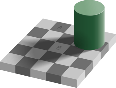
Constancy makes square A appear darker than square B, when in fact they are both exactly the same shade of gray.